How do you enable a teacher to judge a book by its cover?

How do you enable a teacher to judge a book by its cover?

How do you enable a teacher to judge a book by its cover?

Teachers were finding it difficult to find “relevant books” in Splashlearn’s digital Book library, which resulted in all-time-low activation numbers.

Role

Solo Product Designer

Platform

Desktop

D,T,M-Web & iOS app

Timeline

3 weeks • Design

Year

Jan, 2026

Team

Me · Solo Designer

This is 1023

Me · Solo Designer

Neha · PM

Smridhi · Library curator

Sanket · QA

Dushyant, Arun, Ramji · Developers

Key impact

Day 0 Activation

up by 31%

Book assignment rate

up by 26%

2-MIN WALKTHROUGH

TL;

DR

New Book Library Dashboard for teachers
Old Book Library Dashboard for teachers
BEFORE
AFTER
New Book Library Dashboard for teachers
Old Book Library Dashboard for teachers
BEFORE
AFTER
New Book Library Dashboard for teachers
Old Book Library Dashboard for teachers
BEFORE
AFTER

I was the solo designer in the Book Library pod, at SplashLearn, responsible for designing experiences for Teachers and kids.

Teachers couldn't discover the relevant books in SplashLearn's Book Library quickly. NPS feedback was negative.

We redesigned the library around how teachers actually decide on a book, exposing the metadata they cared about (book difficulty, assessments, reading skill alignment) right on the card hover itself.

90 days post-launch: Day 0 activation +24% , Book assignment rate +37%.

ABOUT THE COMPANY

About

SplashLearn

It is a subscription based, digital learning platform with a goal of making learning fun.

Creates interactive and curriculum-aligned games, worksheets, and books that empowers PreK to Grade 5 students to master math & reading.

It is used by elementary school teachers, kids and home schoolers.

It makes money by selling subscription to parents, and acquire parents organically through school teachers.

SplashLearn aims to become Amir Khan from “Taare Zameen Par”, for all kids!

BACKGROUND CONTEXT

The

problem

Problem

statement

Only 21% of new teachers who land on the Book Library feed, get activated!

What is

Activation

in context of new teachers?

A new teacher is "activated" when they do either of these 3 things:

Assign a book to the class or any student.

Open a book and read at least 50% of it.

Save a book to Favourites or create a collection of books and save there.

[ BACKSTORY ]

How it all started

Rapid experimentation and feature launches, lead to a complicated navigation of SplashLearn’s Book Library.

Visibility of the content became low, almost out of sight on landing page.

The existing information layout and cataloging approach was not scalable.

Cartoon showing "rapid feature growth led to a messy library".

NPS feedback that we were receiving from teachers, back then, with old Book Library dashboard.

[ UNDERSTANDING THE USER ]

What teachers want

Teachers are looking for ways to

Support struggling readers, and boost vocabulary.

Boost reading and comprehension skills.

Build background knowledge of topics related to ongoing curriculum.

Improve reading stamina, so that kids can read for longer durations without fatigue.

Inculcate love for reading.

Youtube vlog of a teacher taking group session in Library media centre.

2 TYPES OF TEACHING STYLE

Guided learning

Usually happens with a small group of children, who are struggling in specific areas, or when teaching something new to the whole class.

Independent learning

Aim is to boost comprehension skills which have been already taught, or improve reading stamina and love for reading.

[ WHY THIS PROBLEM AND WHY NOW ]

Business objective

Increase the teacher activation number for new teachers by 20%.

Develop a scalable architecture that can easily accommodate future experiments.

SplashLearn makes revenue from parents, and teachers are the organic user acquisition medium for this.

NAVIGATING THROUGH AMBIGUITY

Figuring out

solution

[ PROBLEM 1 ]

Problem: Cluttered UI and confusing catalogue

1

Multiple layers of hierarchy and too many nested elements.

2

Underutilisation of the left nav, and using too many nested tabs instead.

3

Main content is almost out of the default landing viewport.

Solution and explorations

Selected

Pros

1

Catalogue is organised around teachers’ core use cases.

2

Utilised the left nav to enable access to different sections of the Book Library.
Reading skills is a key use case that significantly drives teacher activation and is easily accessible.

Discarded

Pros

1

Reading skills is a key use case that drives teacher activation and is prominently accessible.

2

Catalogue is organised around teachers’ core use cases.

Cons

1

Banners can feel like advertisement, and this UI pattern has historically seen lower click-through rates.

2

The content is partially cropped by the UI, which makes it harder to access.

Discarded

Pros

1

Clear entry points for key teacher use cases.

Cons

1

Entry-point-led interactions create deep journeys that require multiple back steps to return home, making discovery and exploration hectic.

[ PROBLEM 2 ]

Problem: Friction in decision making

1

Not enough data-points present upfront, for a teacher to decide if a book is useful for them or not.
This information is present inside the book, which requires opening each book one by one.

Teachers will be taking decisions based on things like...

Does this book have too long sentences?

Does this book have too many difficult words?

Does this book have any assessment (quiz) to evaluate the learnings?

Is this book aligned with any specific comprehension skill, that I want to teach this year?

Solution and explorations

Pros

Reading level gives a quick sense of book difficulty, including longer sentences and tougher words.

Shows quiz availability upfront, before a teacher opens the book.

Hovering over a book shows secondary details such as page count and skills covered in the book.

Selected

Pros

Shows all key details upfront so teachers can decide faster.

Cons

Makes the UI cluttered, hides important data-points on the book thumbnail.

Icon-only data-point adds additional learning curve, which is too much for an old teacher having a hectic schedule.

Discarded

Discarded

Pros

Hover state lets us show 3 reading skills.

Cons

Hover feels jarringly strong as a visual change, for a small interaction.

This interaction wouldn’t work in a fixed grid, as the cards can’t shift right to make room

Discarded

Pros

Hover state lets us show more reading skills than any other iteration.

Cons

Icon-only data-point adds additional learning curve, which is too much for an old teacher having a hectic schedule.

On hover, the book’s cover and name disappear, so teachers have to rely on their memory.

[ PROBLEM 3 ]

Problem: Inconsistent navigation across pages

1

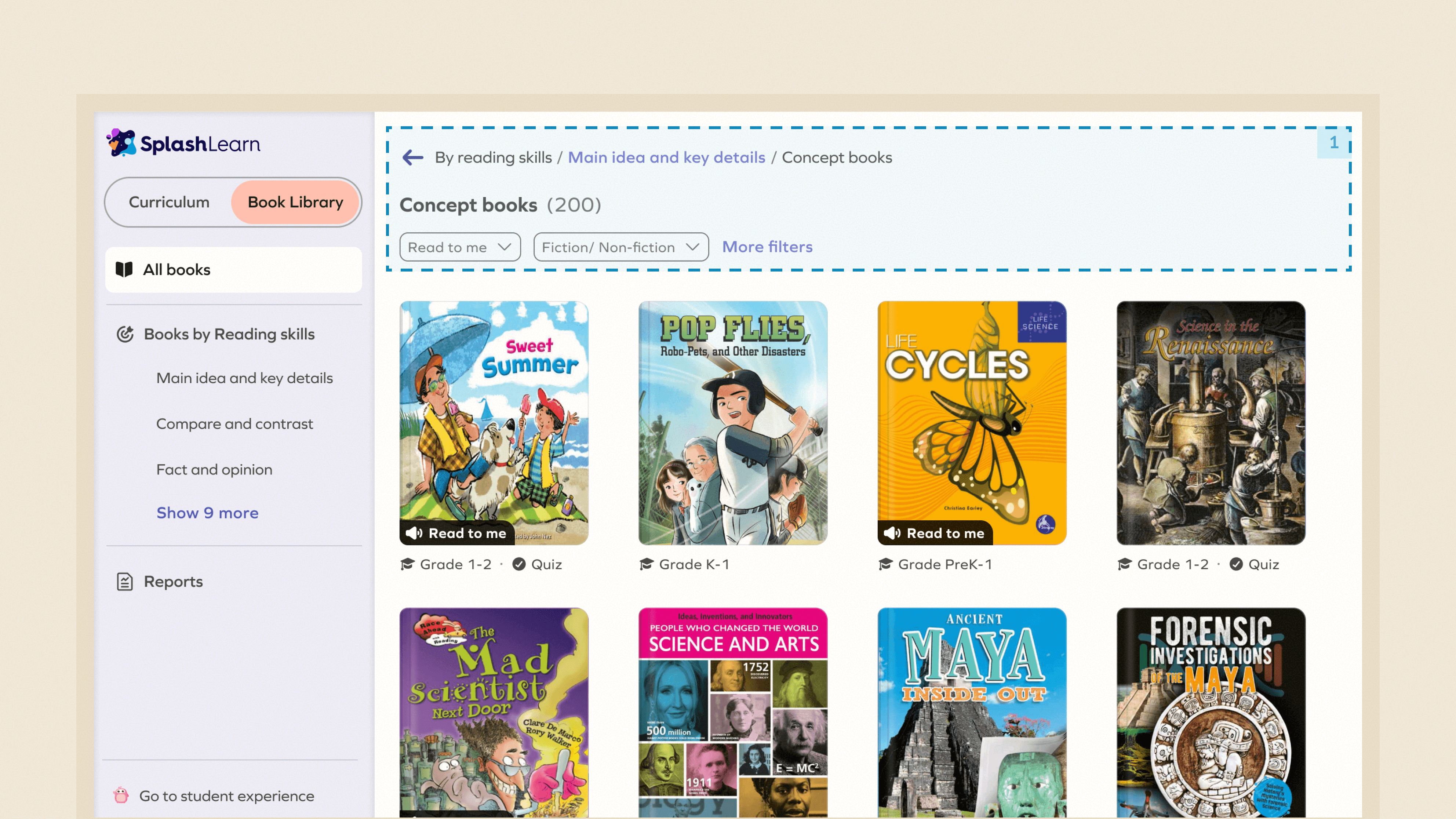
Unnecessary big header on all the pages, pushing the main content below.

2

Inconsistent ways of going back, and filters acting like back button on some pages.

Solution

1

Consistent navigation across pages, supported by clear breadcrumbs and page headings.

[ PROBLEM 4 ]

Problem: Un-intuitive filtering experience

1

Un-intuitive interaction, all filter chips actually are drop downs but don’t have any chevron to signify this.

2

Teachers search by specific reading levels and existing UI required teachers to change reading level frequently, making the experience hectic while exploring because it was not a global filter.

3

A dedicated “More filters” option to view all filters in a single place instead of cluttering the overall UI.

Solution

1

The reading‑level filter works as a global filter that remains applied across all feeds, since teachers typically search for books at a fixed level across the app.

2

Only the most used filters are shown, as compared to the all filters dumped on the interface making the UI cluttered and overwhelming.

3

A dedicated “More filters” option to view all filters in a single place instead of cluttering the overall UI.

[ IMPACT ]

The Results

Day 0 Activation

+ 31%

Book completion rate

Book assignment rate

+ 26%