How do you ask a child, "what they like" without boring them?

How do you ask a child, "what they like" without boring them?

How do you ask a child, "what they like" without boring them?

The existing book library experience in SplashLearn's child facing app, showed a 'generic' feed of books that did not reflect what users (children) liked, leaving Day-0 activation flat.

Role

Solo Product Designer

Platform

D,T,M-Web and iOS app

D,T,M-Web & iOS app

Timeline

3 weeks • Design

Year

Apr, 2026

Team

Me · Solo Designer

This is 1023

Me · Solo Designer

Neha · PM

Smridhi · Library curator

Sanket · QA

Dushyant, Arun, Ramji · Developers

Key impact

Day 0 Activation

up by 43%

Book completion rate

up by 37%

TL:DR

Quick

summary

[ The Problem ]

Only 18% of new users (kids) of the Book Library, get activated!

A new user (kid) is "activated" when they read at least
50% of a book.

A new user is "activated" when they read at least 50% of a book.

A new user (kid) is "activated" when they read at least 50% of a book.

[ My contribution ]

Designed and built a playful onboarding flow in Rive that can capture every kids' reading interests.

Designed and built a playful onboarding in Rive that can capture kids' reading interests.

This enabled the Book Library to show a personalised feed to every user.

ABOUT THE COMPANY

About

SplashLearn

It is a subscription based, digital learning platform with a goal of making learning fun.

Creates interactive and curriculum-aligned games, worksheets, and books that empowers PreK to Grade 5 students to master math & reading.

It is used by elementary school teachers, kids and home schoolers.

It makes money by selling subscription to parents, and acquire parents organically through school teachers.

SplashLearn aims to become Amir Khan from “Taare Zameen Par”, for all kids!

BACKGROUND CONTEXT

The

problem

Problem

statement

Only 18% of new students who land on the Book Library feed, get activated!

What is

Activation

?

in context of new teachers?

A new student is "activated" the moment they open a book and read at least 50% of it.

The library was generic for all kids, and showed same content as per the grade level.

Although there was an algorithm to recommend books, but it required the user to open and read atleast one book.

But kids wouldn't tap a thumbnail unless the content is as per their interest.

The classic chicken and egg problem.

[ BRIEF FROM PM ]

The brief, that I got

Hey Prabal! We want to understand what the user (child) is interested in so that we can show them better books which are aligned with their interests.

The aim is to improve the child activation, for new users, by 20%.

Lets create a pop-up, and ask users to choose what interest areas they like.

Animation showing the pop-up to "ask interest".

Animation of a pop-up getting closed.

[ PUSHBACK ]

But, where I pushed back…

Modals work when the user has a reason to engage with them.

A popup landing out of nowhere is going to feel like a blocker in the user's journey.

Or will tap something randomly, because they did not understood the prompt.

NAVIGATING THROUGH AMBIGUITY

Navigating through

the problem

[ DECISION 1 ]

Where do you ask a 6-year-old "what they like"?

I did secondary research, using Mobbin, and found out key UX patterns regarding this problem.

Almost all the apps, ask their users what they like during the onboarding while setting up their app experience.

But this won't be applicable for SplashLearn, because…

Video of the onboarding of the SplashLearn's B2B web app.

Our research showed that parent set up their child's profile on Day-0 on SplashLearn app.

Hence the main onboarding is designed for parents.

Besides, it was already very lengthy and adding something new there could have badly affected the onboarding conversion funnel.

Video of the onboarding of the SplashLearn's B2B app.

The onboarding on the B2B app was driven by teachers.

Teachers logged in on kids' devices so that they can directly work on the assigned activity.

Hence, adding anything there could have made the teacher's life hectic!

So when is the

right time to ask

these questions?

The most obvious instance in the kid's experience journey, where we can safely assume that they are interested in reading books is when they click on the Books tab. Assuming, the user has not clicked accidentally.

Video showing "Clicking on the books tab".

[ DECISION 2 ]

What all questions should you ask?

If you ask a kid, directly, why did you click on a book? They will mostly say “because it looked fun!”.

But, what makes something "fun" for a child?

From previous interviews, we knew, it is the topic of the book (fairy tales, animals, minecraft, etc) and what is visible on the thumbnail. If that looks “exciting”, then it will get clicked.

Opening a book and reading it, are two different things

Activation is about both opening and reading more than 50% of the book. Hence, we tried to gauge other information as well.

What makes a child continue to read a book that they have opened?

Type of the book (fiction or non-fiction)

Format of the book (read-aloud, picture book, comic, etc)

Difficulty of words/vocabulary are used in the book

How many number of pages are there in the book

Option 1: Asking about interest, book format and type of book

Discarded

Pros

Getting richer data and context for better personalisation eventually.

Cons

Longer journey where each step is a cognitively heavy question making the journey feel tiring.

Chances of assumption, as the clicks will be driven from the visuals in the thumbnails, rather than the concept asked in the actual questions.

Option 2: Asking only about interests and then showing books to gauge if they would read it or not?

Discarded

Pros

Getting richer data and context for better personalisation eventually.

Cognitively less tiring, because the question asked is about one book at a time.

Cons

Correlating the cover of the books with the concepts like book type, or book format can lead to false assumption based personalisation.

Option 3: Asking only about interests and depend on the catalogue

The books which are tagged to lower grades (PreK - Grade 1) comprises of mostly books with more pictures, less texts and easier words and vice versa for higher grades (grade 3-5). Hence, this exploration relied on the catalogue itself and focussed only on getting the preferred interest choice from kids.

Selected

Pros

Smallest and simplest user flow.

No false assumptions about the likes and dislikes of the kid.

Cons

Too many options to choose from on the interest selection screen.

[ DECISION 3 ]

What is the easiest way for a kid to choose what they like?

Screenshots from some of the usability testing session.

In order to ensure that the interaction is easy and intuitive for kids, I conducted a usability test with two prototypes.

The prototype was created on Figma, using variables and logic based prototyping through conditionals, in order to make the flow feel real.

The testing was done with SplashLearn's employee kids, since the objective was to check the usability of interactions.

We found PreK kids to heavily depend on the voice-overs, as they had limited english vocabulary. Hence, the research team helped us with interviewing 5 kids from US, who were not a SplashLearn user.

Option 1: Asking about one interest at a time

This was inspired by the right and left swipe interaction of dating apps. But since the kids do not have very developed motor skills, we used a click based interaction and showed a thumbs up and thumbs down button.

Discarded

Pros

Kids were able to figure out where to click and how to navigate through the flow.

Cognitively very light.

Even though the number of clicks were high in the journey, the journey “felt” small.

Cons

Kids clicked the "Tick" button on almost all the interest questions because they did not have any reason to NOT “like” something, which defeated the purpose of this experience!

When kids did not understand what to do, they ended up clicking on the tick button because it was of green colour, which resulted in false positives.

Exiting the flow, by clicking "Skip" button on top right, was not intuitive.

Option 2: Asking to choose from two interest options at a time

This was inspired from a youtube video for kids, where they have to answer “Which is your favourite among these two?” questions.

Selected

Pros

Kids were able to figure out where to click and how to navigate through the flow.

Simple and intuitive user flow.

A forceful binary choice between two options gave true and stronger signal of preference.

Exiting the flow, by clicking "Cross" button on top right, was intuitive for kids.

Cons

Did not give a comparison of the preferences, amongst each other. Like, which interest is the most liked and which is least.

Other learnings from the usability testing

Problem: The long wait for the voiceover made the kids uneasy.

Solution: Broken the big copy "Let's find you some great books! First, tell me what you love." into two parts, which appeared one after the other.

Before

Big copy used earlier: "Let's find you some great books! First, tell me what you love."

After

Broken into two parts: "Let's find you some great books!" and "But first, tell me the kind of stories you like to read."

Problem: Kids were unclear about the purpose of the questions and the outcome that would follow.

Solution: Added a hint of books/stories in all the dialogues. And added a book element in the thumbnails.

Before

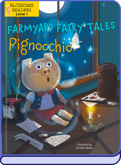
  • Old copy: "Would you rather pick Farm animals or Fairy tales?

  • Thumbnail focussed only on the core interest area.

After

  • New copy: "Would you rather pick books on Animal tales or Fairy tales?

  • Thumbnail showing interest area with a book.

Shaping the audio experience for kids

Kids have limited vocabulary and reading skills, hence voice over makes the experience accessible for them.

Instead of boring voice overs, I made the audio experience more engaging and playful, while keeping the character and tone of our mascot, Splashee, in mind.

To make the experience more engaging, I also created SFX so that the animations feel more real!

I used

to brainstorm and write prompts for generating all the audio files, using

.

Some iterations for one of the voice-over that I generated using

Dialogue: "What do you like more, funny stories or spooky stories?"

Selected

0:00/1:34

Why this works?

Slight pause before announcing the two options to choose from.

Dramatic way of saying "Spooky stories", which can add to the excitement.

Follows the character guidelines of the mascot, Splashee. Sounds curious, and feels fun to talk to.

Discarded

0:00/1:34

Why this doesn't work?

No emphasis on the two options to choose from.

Sounds too plain.

Discarded

0:00/1:34

Why this doesn't work?

Does not follow character's dialogue guidelines.

No emphasis on the two options to choose from.

Some of the SFX that I generated using

SFX for transition

Splashee morphs into its head and vice versa

SFX for card UI

Appearance of the cards

SFX on user's action

When the user clicks on a card

SFX for the loader UI

When the book suggestion loads

SFX for the loader UI

Bubble appears and pop

SFX for the loader UI

Background music for the loader

WHAT I BUILT INSTEAD

Final

solution

WHAT I CREATED

The final

solution

[ IMPACT ]

The Results

Day 0 Activation

+ 43%

Book completion rate

+ 37%